To design my first application, I started off by analyzing the user group and made notes on what they use and what they'd like to have. I then made a few rough sketches of some ideas.

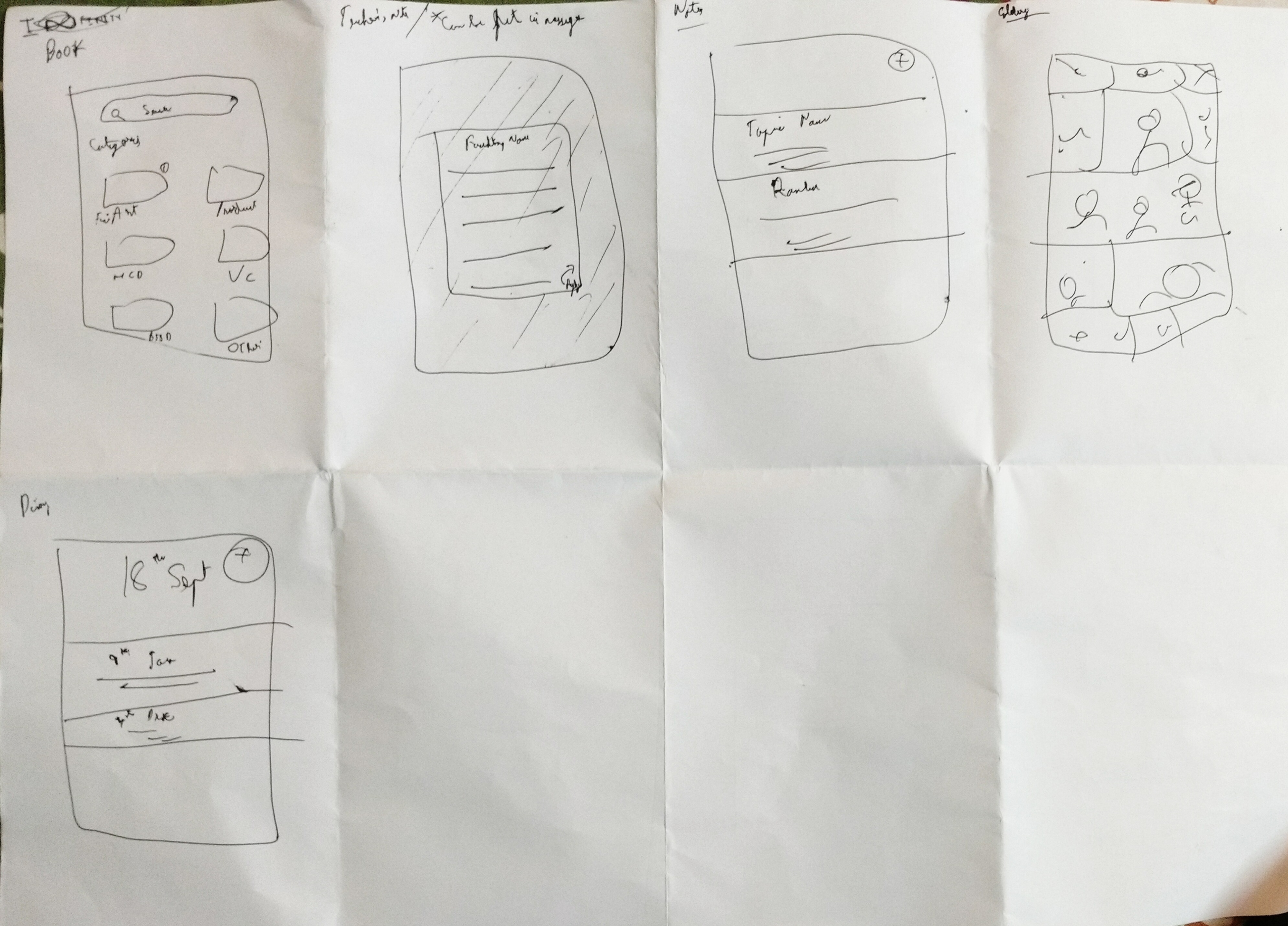
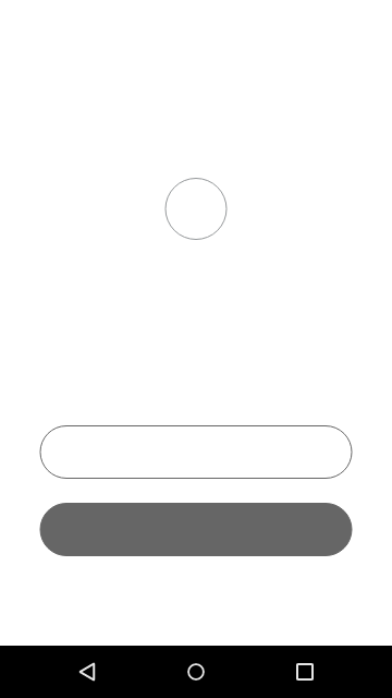
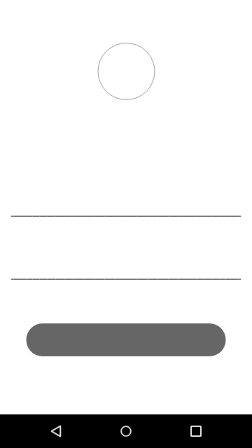
I then created basic, low fidelity grey scale wireframes for the screen I was designing for.
Login Screen LoFi 1
Login Screen LoFi2
Home Screen LoFi
The next step was to experiment with various color palettes on the home screen.
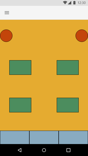

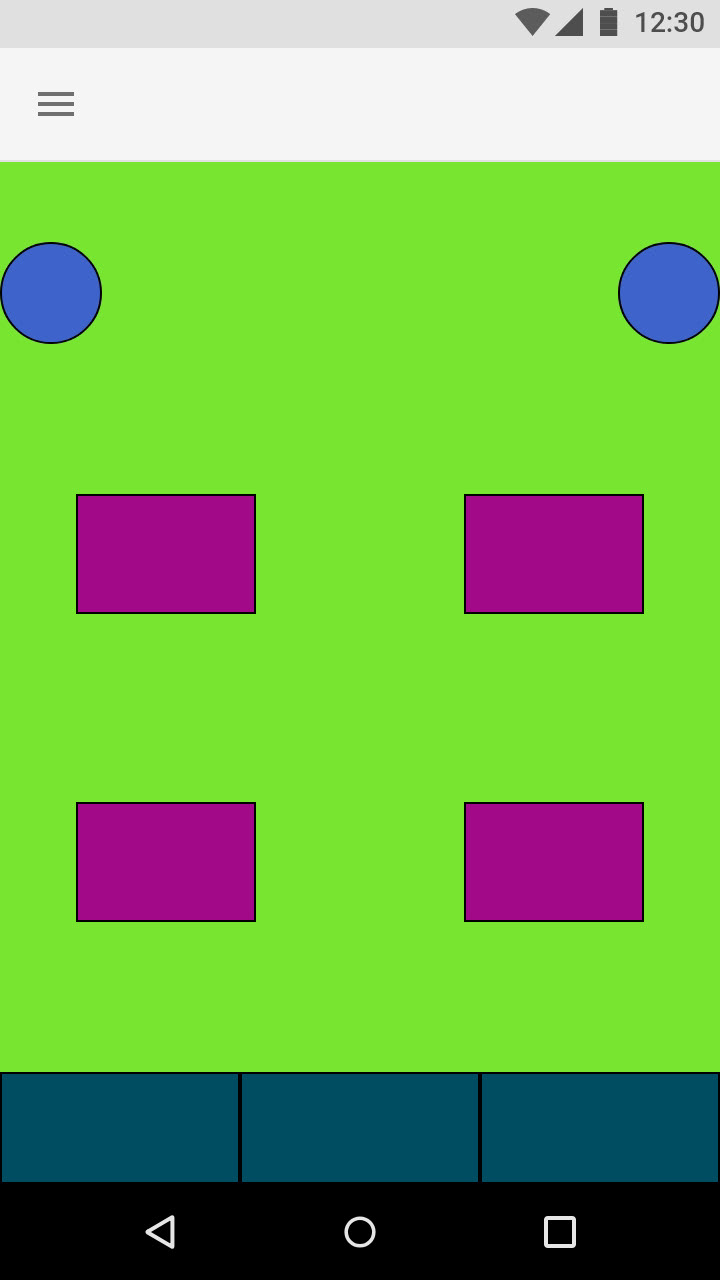
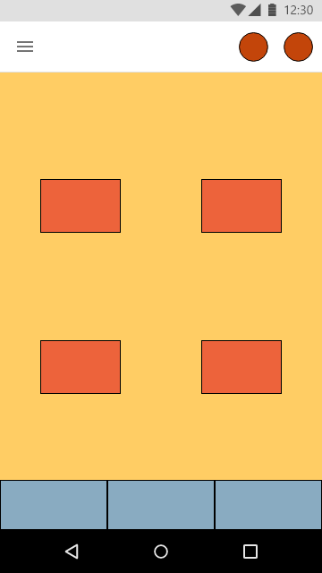
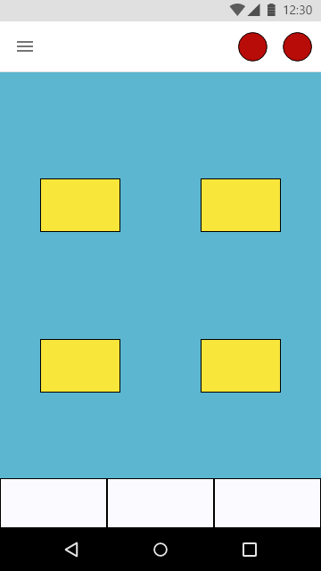
This is when I realized the two circles weren’t working well, on the top of the screen. So, I moved them right on top, as seen next and continued playing with the color palette and layout.

I now chose the layout I liked the most and started placing my icons and text into the home screen. The typeface I used is Source Sans Pro and the Text would be in Black and White depending on its location.
Now that I liked how it was coming out, I created a style guide to design the rest of the app.
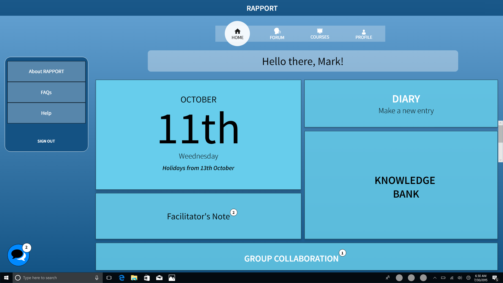
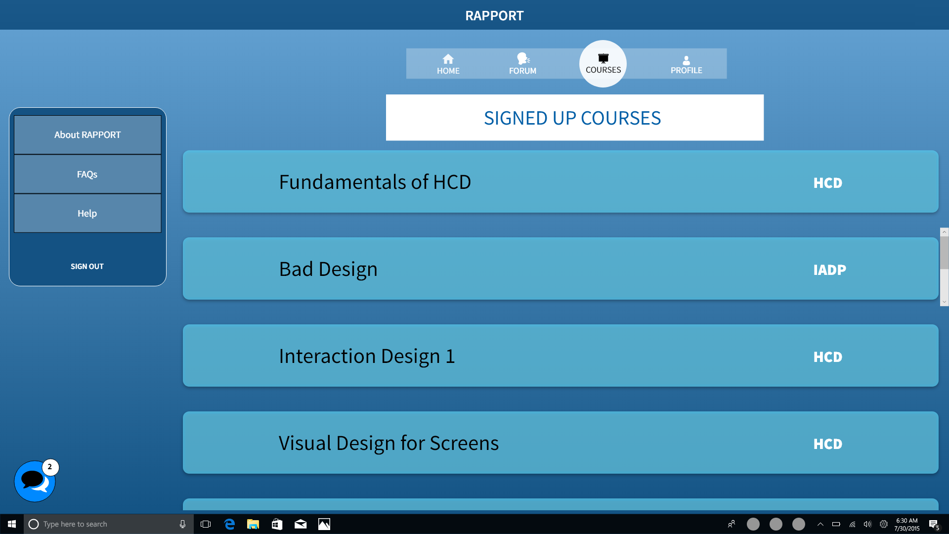
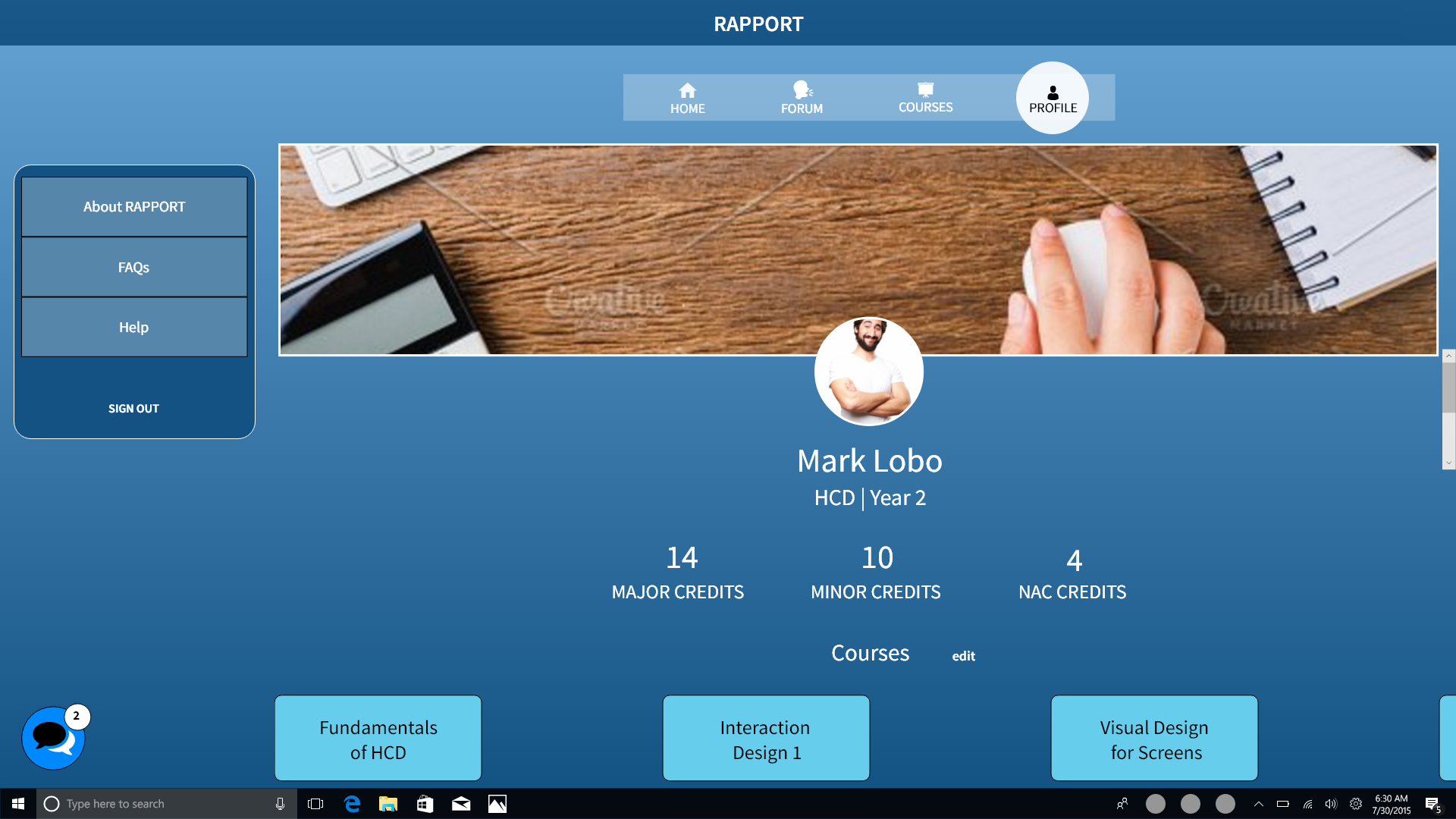
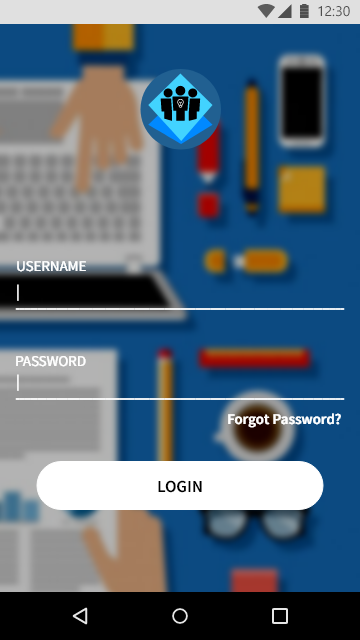
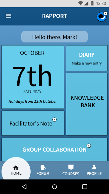
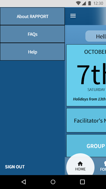
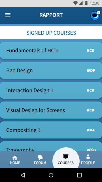
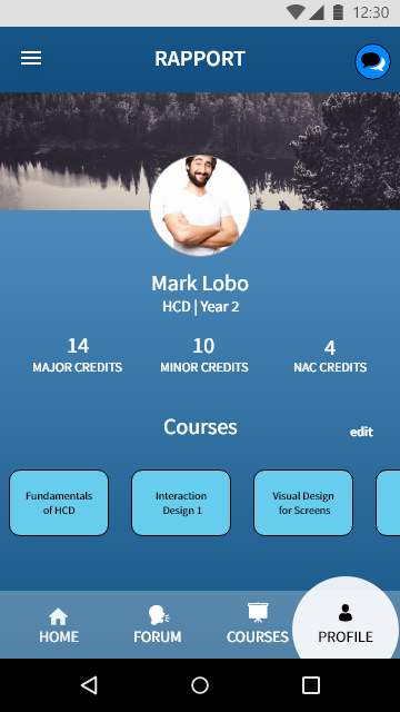
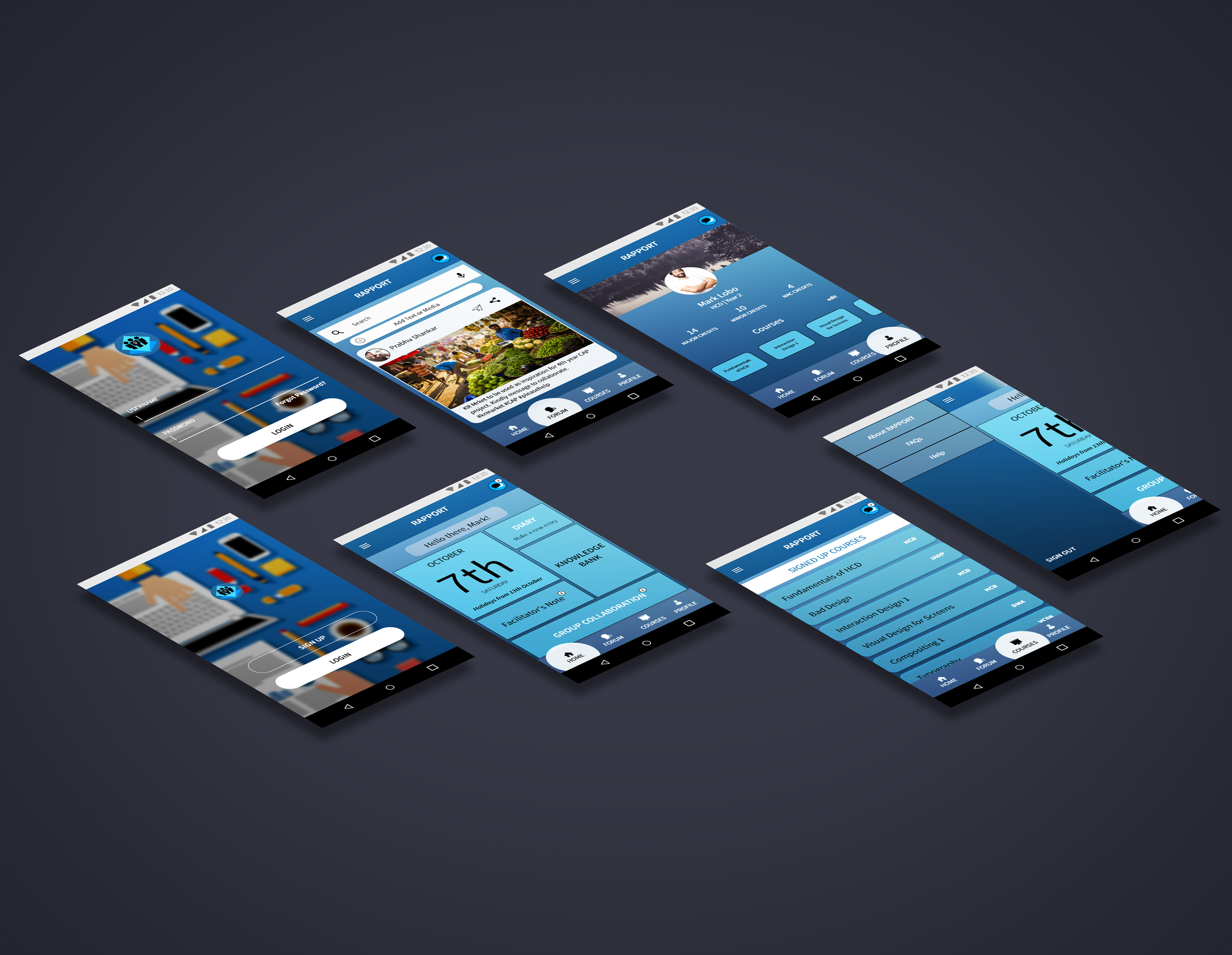
The final app - Rapport

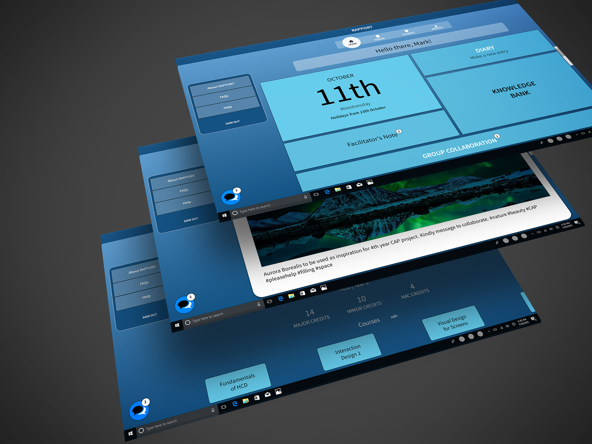
I also created a Desktop version of the screens using the Style Guide that I had previously created.